 efistu.com Home Decor
In a world bustling with noise and rapid-paced living, the allure of tranquility begins to beckon from the heart of the home—a sanctuary where comfort and style converge.The farmhouse living room, with its rustic charm and inviting warmth, serves as the ideal canvas for creating a peaceful retreat. But how do we breathe life into this serene space? The answer lies in the palette of colors we choose to adorn its walls and furnishings. In this guide, ”Embrace tranquility,” we will explore the art and science of color selection, unraveling the emotional impact and aesthetic harmony that the right hues can bring to your farmhouse living room. From soothing neutrals to nature-inspired shades, join us on this journey to discover how to cultivate a harmonious oasis that reflects both your style and your desire for a relaxed, tranquil atmosphere.
Embracing Warm Neutrals to Create a Cozy Atmosphere in Your Farmhouse Living Room
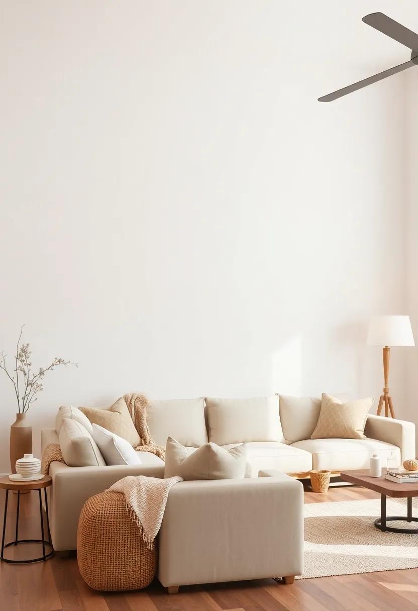
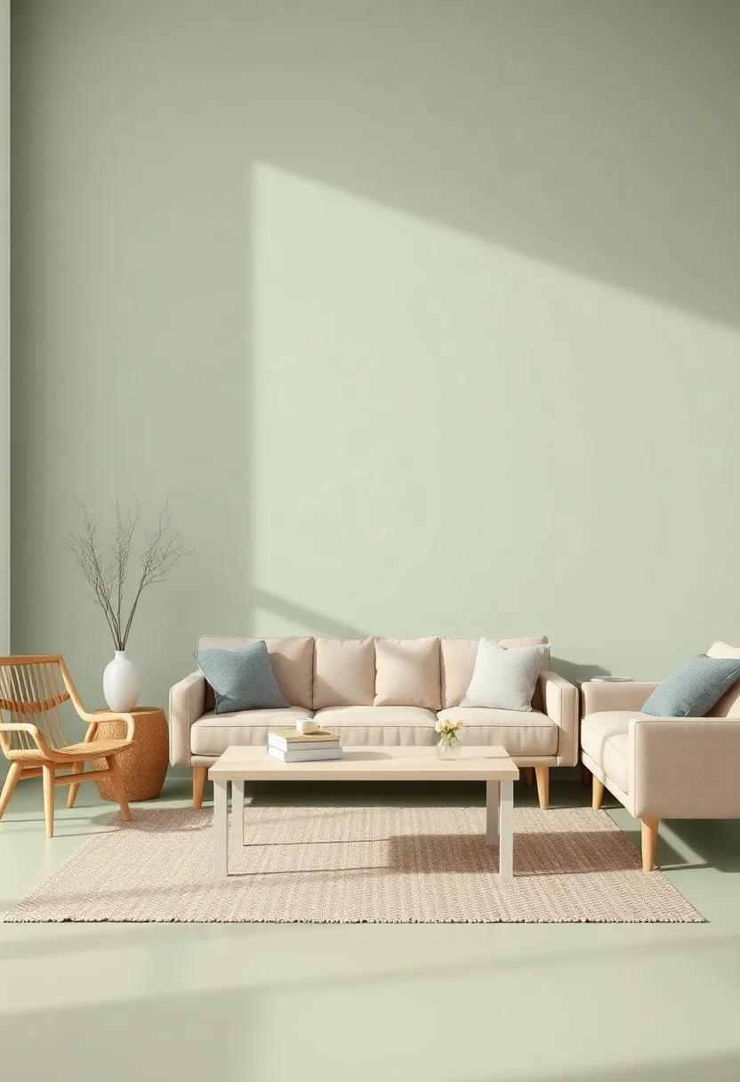
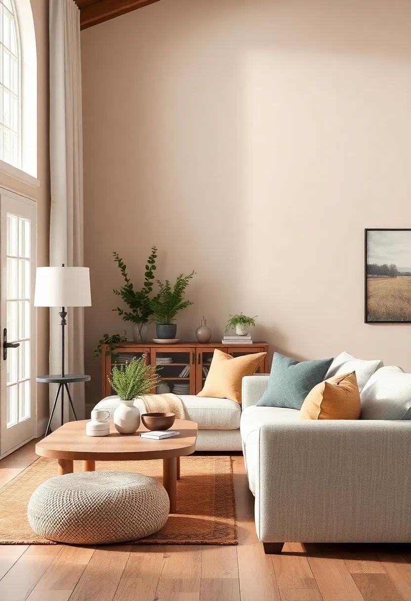
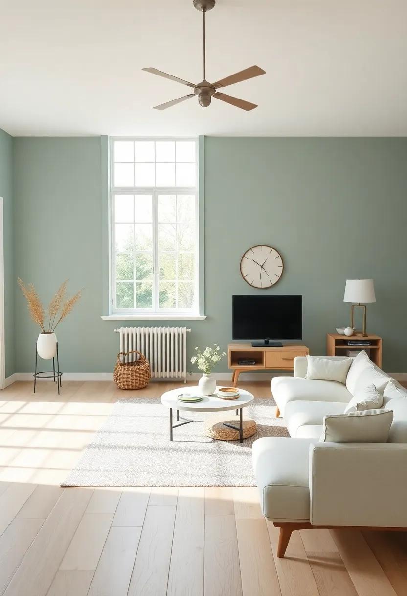
Infusing warm neutral tones into your farmhouse living room sets the stage for a serene and inviting atmosphere. These hues—think sandy beiges, rich taupes, and soft creams—allow the space to feel cohesive and grounded. Incorporating these natural shades can accentuate the rustic elements of your decor while promoting warmth and comfort.Consider layering textures through various materials such as linen, cotton, and wool, which can add depth and interest without overwhelming the soothing color palette.
To achieve the perfect balance,mix and match different warm neutral tones and accentuate them with carefully selected decor items.A few suggestions include:
- Pillows: Choose cushions in muted earth tones to introduce subtle variations.
- Artwork: Opt for pieces that incorporate warm neutrals, bringing cohesiveness to the overall design.
- Rugs: layer a soft,textured rug in a neutral shade to enhance the warmth.
Moreover, consider the lighting in your space. Natural lighting can enhance these warm tones, making them feel even more inviting. A combination of pendant lights and table lamps with warm yellow bulbs can create a cozy glow, further establishing that tranquil ambiance essential for a farmhouse living room.
Capturing the Essence of Soft Earth tones for Calming Aesthetics
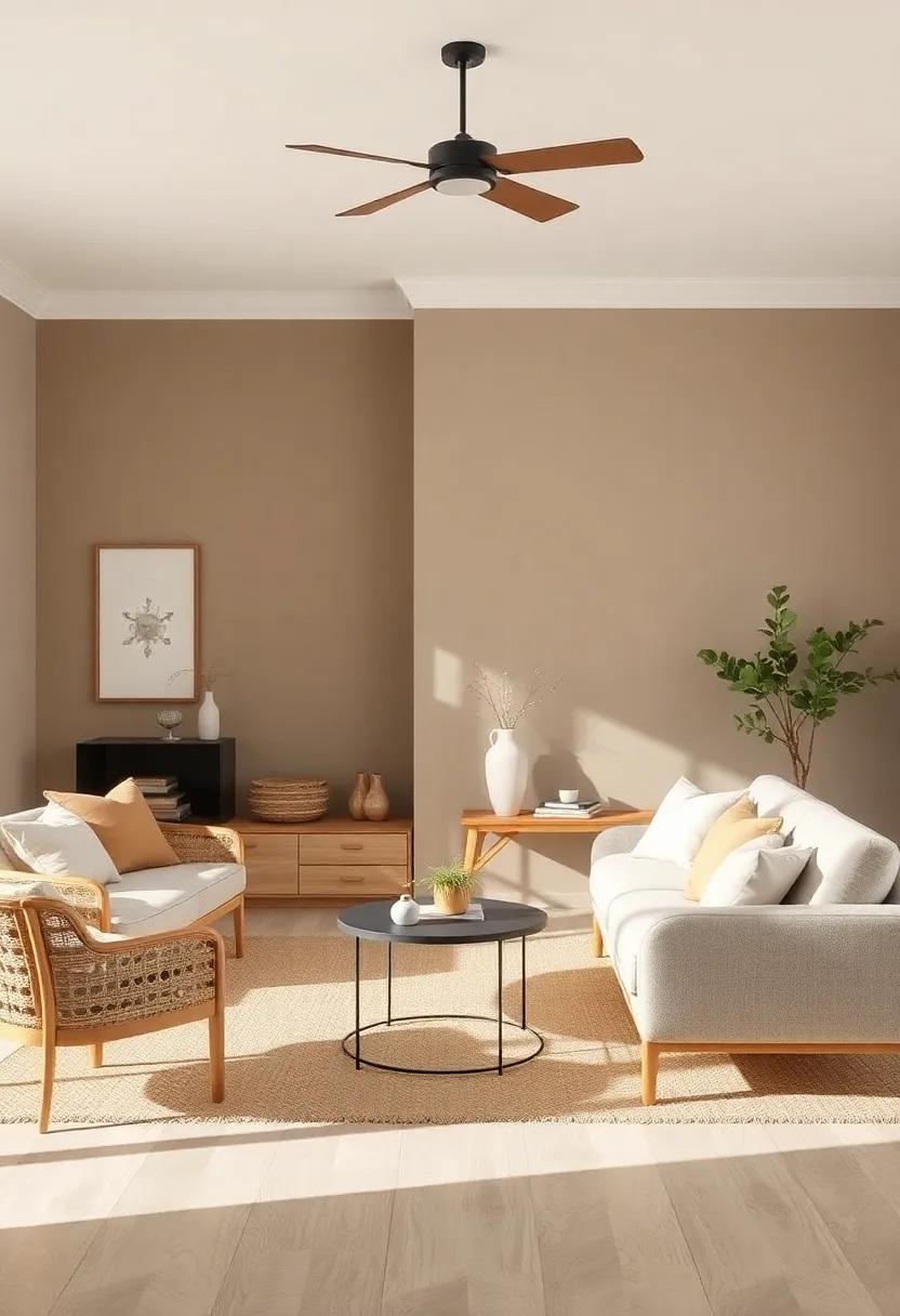
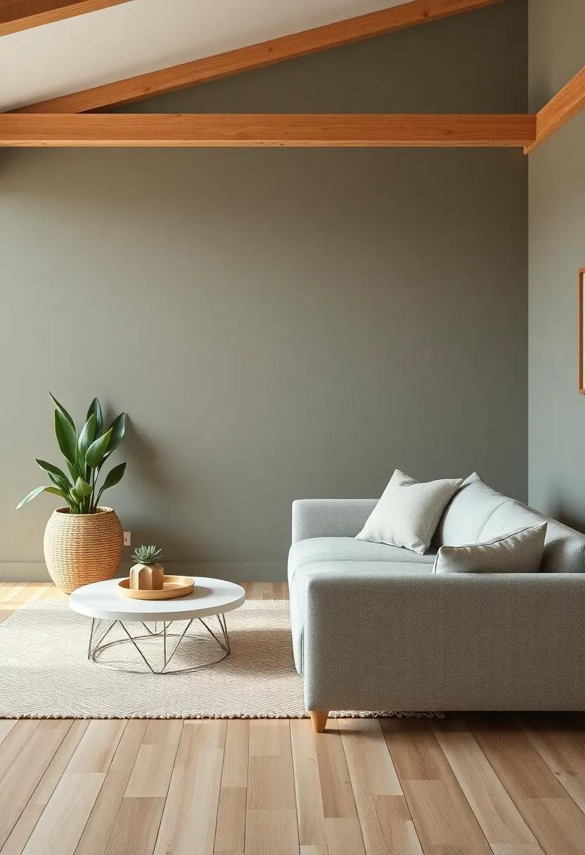
Incorporating soft earth tones into your farmhouse living room creates a warm and inviting atmosphere that speaks to the very heart of natural beauty. Shades like gentle taupe, muted greens, and soft rust evoke a sense of peace, allowing for a seamless connection to the outdoors. These colors reflect the serene landscapes surrounding your home, merging interior comfort with the tranquil essence of nature. By layering various tones, you can enrich your space, elevating it to a sanctuary where you can unwind and recharge.
To effectively embrace this calming palette, consider the following elements:
- Textiles: Choose cushions, throws, and rugs that feature subtle patterns in earth tones.
- Wall Colors: soft beige or light sage as a backdrop can perfectly complement wooden accents.
- Art and Decor: Incorporate artwork that features natural scenes or abstract forms in warm hues.
- Furniture: Opt for pieces in distressed finishes that reflect the natural beauty of aged materials.
In creating a cohesive design, it can be helpful to visualize potential color combinations. Below is a simple color palette table to inspire your choices:
| Color | Hex code | Emotional Impact |
|---|---|---|
| Soft Taupe | #BFA6A1 | Comforting & Grounding |
| Muted Sage | #C0D6B0 | Refreshing & Calming |
| Warm Rust | #D67A6E | Cozy & Inviting |
| Dusty Blue | #A3C1D4 | Serene & Trustworthy |
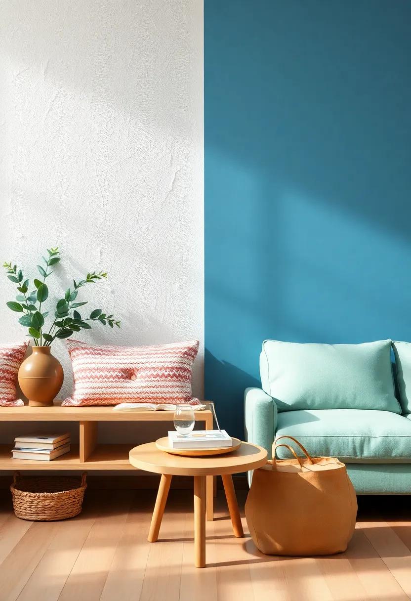
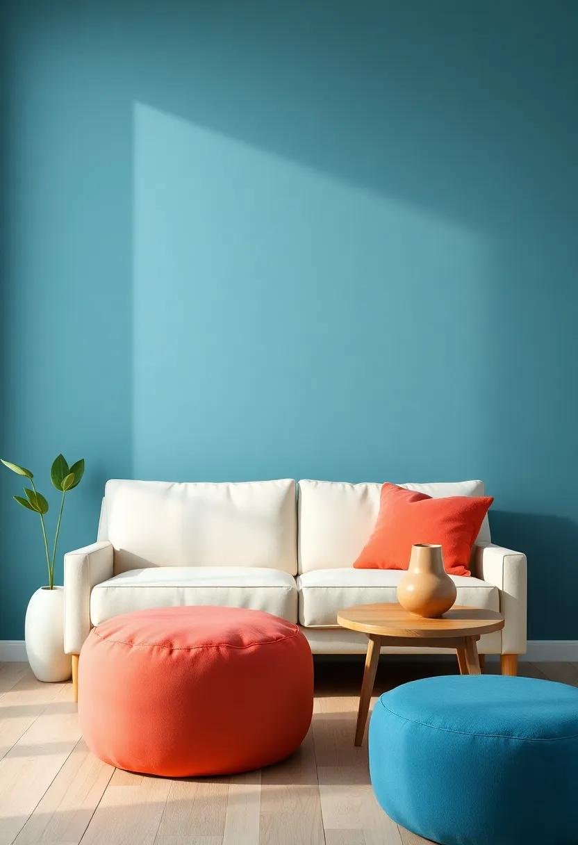
Elevating Your Space with Subtle Shades of Blue for Serenity
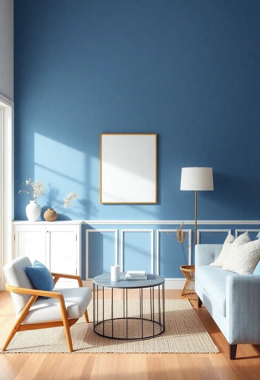
Incorporating various shades of blue into your living room design can transform the atmosphere into one of soothing calmness. From pale sky hues to deeper navy tones, each shade brings its own unique vibe, harmonizing beautifully with farmhouse elements such as reclaimed wood and natural fabrics. When selecting the perfect blue for your space, consider how the color interacts with natural light throughout different times of the day.Choose subtle shades that invoke feelings of tranquility while complementing the rustic charm of your farmhouse decor.
To create a cohesive look, you might wont to experiment with a combination of soft blues and complementary colors. Here are some options to mix and match that can elevate the tranquil essence of your living room:
- Pale Blue: perfect for walls or soft furnishings, adds a breath of fresh air.
- Steel Blue: Works great as an accent color for furniture and decor pieces.
- Turquoise: Brings a pop of color, perfect for throw pillows or art.
- Slate Blue: Ideal for grounding the palette; think area rugs or curtains.
This harmonious palette not only enhances the serenity of your farmhouse living room but also encourages a relaxed, welcoming ambiance, inviting you and your guests to unwind.
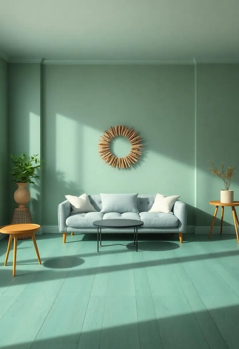
Incorporating Pops of Soft Green to Bring Nature Indoors
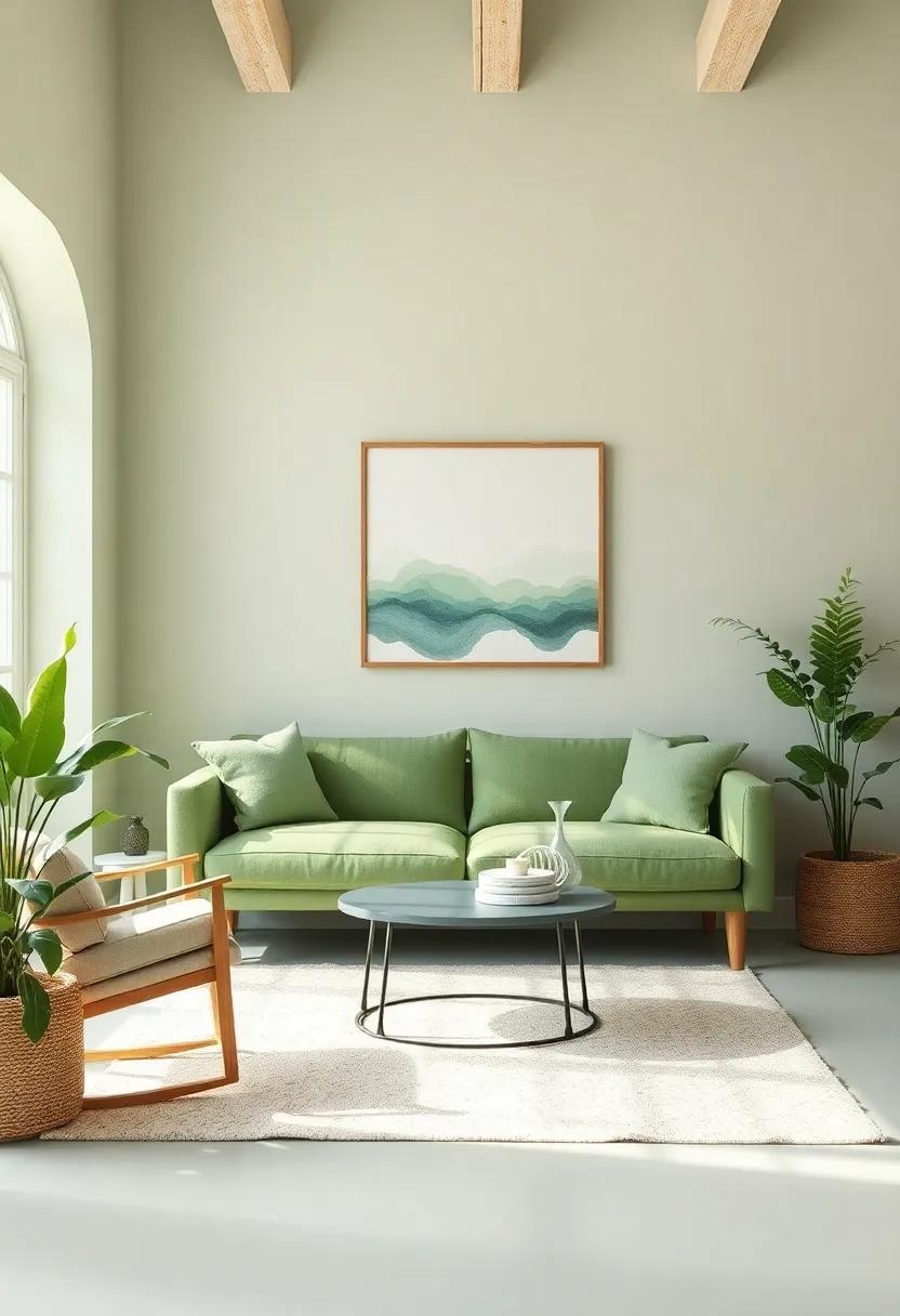
Infusing your living space with soft green hues can evoke a sense of calm similar to a serene woodland retreat. This serene color can evoke feelings of tranquility and rejuvenation, making it an ideal choice for a farmhouse living room.Consider adding accent pillows or throws in gentle shades of green to your seating area. These elements can be easily switched out seasonally, allowing for a fresh feel without a complete redesign. additionally,incorporating plants with soft green leaves or even flower arrangements featuring this hue can further enhance the connection to nature.
To achieve a balanced look, you can create a harmonious color scheme by pairing soft green with neutral tones such as beige, cream, or soft browns. these colors not only complement green well but also reflect the natural materials typically found in farmhouse settings. You can also add textured elements such as woven baskets or wooden accents to bring depth to your design. For a cohesive design approach, consider using a color palette table to visualize the combinations:
| Color | Complementary Shades | Texture Ideas |
|---|---|---|
| Soft Green | Beige, Cream, Soft brown | Woven Fabrics, Natural Wood |
| Mint Green | light Gray, Soft Peach | Jute, Wicker Accents |
| Olive Green | Warm Whites, Rust | Leather, Distressed Finishes |
Balancing Bold Hues with Gentle Accents for Visual Interest
When designing a farmhouse living room, the interplay between vibrant colors and softer tones can create an surroundings that captivates the eye while maintaining a sense of calm. To achieve this balance, consider incorporating bold hues such as deep greens or rich blues alongside gentle accents like soft whites, muted pastels, or subtle grays. These elements can serve to ground the room,allowing the bolder shades to pop without overwhelming the senses. Some effective combinations include:
- Forest Green with Cream
- Terra Cotta with Light Beige
- Navy Blue with Soft lavender
Incorporating various textures can further enhance this dynamic.Use cozy textiles like linen cushions or cotton throws in soft colors to complement striking furniture pieces. To add depth, consider placing a table that boasts both vibrant and neutral elements, exemplifying modern rustic charm. Here’s a simple layout for such a table that juxtaposes bold and gentle tones:
| Bold Color | Gentle Accent |
|---|---|
| Mustard Yellow | Soft White |
| Rust orange | Light Gray |
| Charcoal Black | Pale Pink |
This combination approach not only adds visual interest but also harmonizes the energy of the space, making your farmhouse living room a sanctuary of comfort and aesthetic appeal.
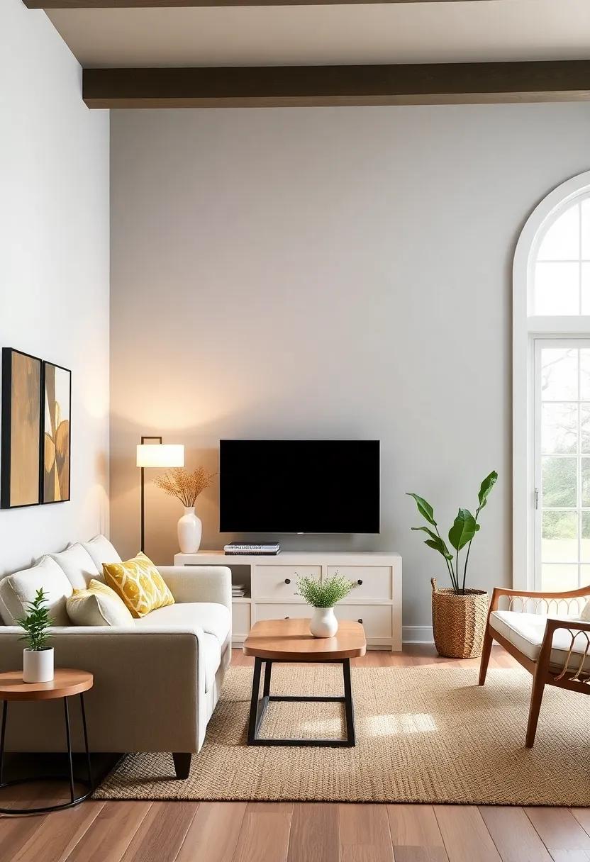
Utilizing White as a Timeless Base for a Breathable Space
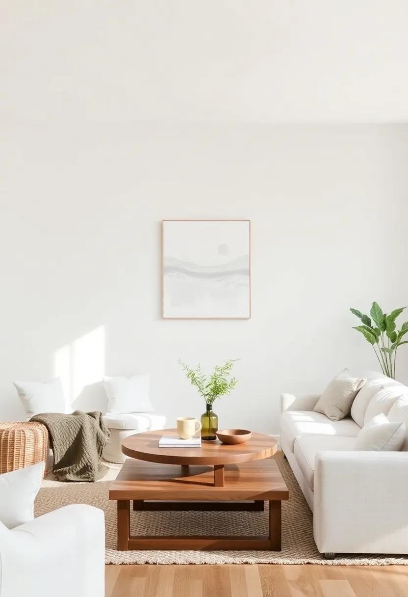
Incorporating white into your farmhouse living room serves as a beatiful canvas that reflects light and invites tranquility into your home. This versatile base color pairs seamlessly with a variety of textures and materials, creating a harmonious balance. Whether you opt for creamy whites, luminous whites, or soft off-whites, you’ll find that these shades enhance the spaciousness of your environment, making the room feel airy and open. To complement the white backdrop, think about incorporating natural elements, such as:
- Wood accents for warmth
- Textured fabrics like linen or cotton for coziness
- Greenery to add a touch of nature
- Layered lighting for depth and dimension
Furthermore, the minimalist appeal of white allows for creative expression through accent colors and decorations. Soft pastels, deep earthy tones, or even bold pops of color can provide character without overwhelming the serenity offered by white walls and furnishings. To truly enhance the aesthetic, consider a structured color palette that balances these vibrant accents. Below is a simple guide to assist you in pairing colors with white elements:
| Accent Colors | Complementary Effect |
|---|---|
| Soft blue | Creates a calming atmosphere |
| Terracotta | Adds warmth and earthiness |
| Mustard Yellow | Injects cheerfulness and energy |
| Forest Green | brings a touch of nature indoors |
Exploring the Allure of Warm Grays for a Modern Touch
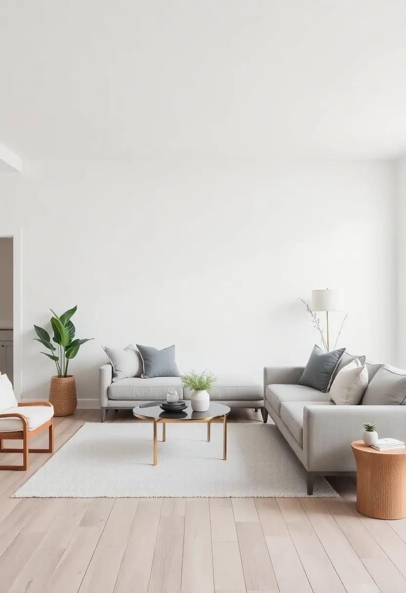
Warm grays have emerged as a subtle yet captivating choice for modern farmhouse interiors, bridging the gap between rustic charm and contemporary elegance. This versatile hue offers a neutral backdrop that maintains a sense of calm while allowing for creative expression. Layering different textures and materials, such as distressed wood and plush fabrics, against a warm gray palette can accentuate the comfort and inviting essence of a living room, evoking a feeling of tranquility—and that’s what every homeowner truly desires.
Moreover, warm grays harmonize beautifully with a variety of colors, enabling you to personalize your space with ease. Consider pairing these shades with accents of soft whites, muted pastels, or even deep jewel tones for a striking contrast. The versatility extends to various decor styles, whether you prefer rustic farmhouse charms or sleek modern lines. below is a curated selection to inspire your color pairing journey:
| Accent Color | Effect |
|---|---|
| Soft Whites | Brightens space,creating airy ambiance. |
| Muted Pastels | Adds a gentle touch, promoting relaxation. |
| Deep Jewel Tones | Creates dramatic contrasts, enhancing warmth. |
Painting Accents Walls: A Creative Way to Add Depth and Charm
Accent walls are a transformative design element that can introduce a sense of depth and character to your farmhouse living room. By selecting a color that contrasts or complements your primary wall color, you can create a focal point that draws the eye and enhances the overall aesthetic of the space. Consider using soft whites paired with a muted sage green or a warm beige against a backdrop of creamy off-white to maintain that serene farmhouse vibe while still introducing a touch of excitement. Textures also play a crucial role; consider using natural wood panels or shiplap alongside the paint to add dimension and warmth.
When it comes to choosing the right color for your accent wall, think about the emotions you wish to evoke in the room. Popular choices include:
- Soft blues for a calming effect
- Muted mauves for a cozy, inviting atmosphere
- Earthy greens to bring nature indoors
- Subtle grays to create a elegant backdrop
The key is to choose shades that harmonize with your furniture and decor while encapsulating the tranquil, rustic charm of a farmhouse aesthetic. Balancing your colors will help you achieve a holistic, welcoming space where comfort and charm coexist beautifully.
Crafting tranquil Vibes with Muted Pastels in Decor
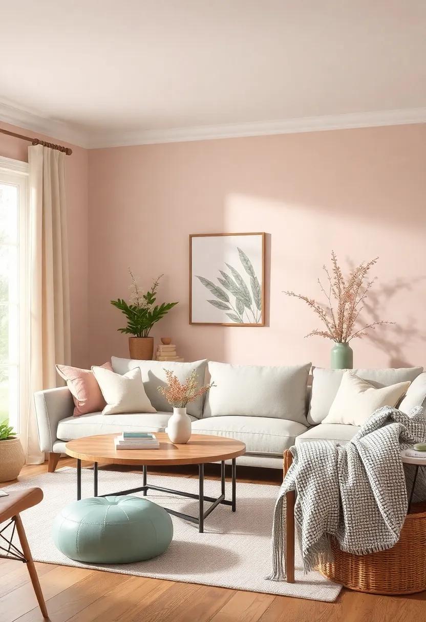
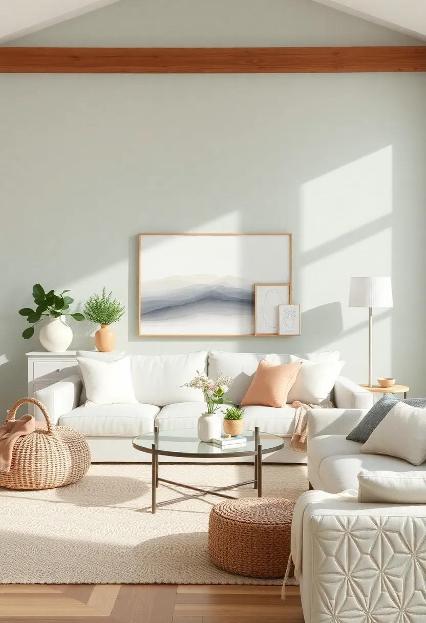
The soft embrace of muted pastels brings a gentle,soothing energy to any living space,perfectly aligning with the essence of farmhouse decor. Opting for colors like powder pink, seafoam green, and soft lavender not only promotes tranquility but also creates a harmonious backdrop that complements the rustic charm of the farmhouse aesthetic. When you incorporate these colors, consider pairing them with natural materials like weathered wood, linen, and jute to enhance the calm atmosphere. Such combinations allow each piece to breathe, giving your living room a light and airy feel that invites relaxation and comfort.
To effectively utilize muted pastels in your decor,focus on a balanced palette that is cohesive yet varied. Here are some tips to achieve this balance:
- Accent Walls: Choose one wall to paint in a soft pastel to create a focal point.
- Textiles: Incorporate cushions and throws in assorted muted pastels to introduce layers without overwhelming the space.
- Artwork: Select pieces that feature pastel tones to tie the decor together.
- Plants: Add greenery in simple pots that match your color scheme for a touch of life.
| Color | Emotion Evoked |
|---|---|
| Powder Pink | Comfort and warmth |
| Seafoam Green | Calmness and serenity |
| Soft Lavender | Peace and tranquility |
Pairing Natural Textures with Color for an Inviting Feel
To create an inviting ambiance in your farmhouse living room, consider combining natural textures with a thoughtful color palette. The inherent warmth of materials like wood, stone, and linen can be beautifully complemented by hues found in nature. For instance, soft greens reminiscent of a peaceful meadow pair wonderfully with sandy taupes and earthy browns. These combinations not only draw the eye but also foster a sense of calm, enhancing the cozy, lived-in feel of your space. Other color pairings to consider include:
- Muted blues with weathered gray elements
- muted terracotta alongside off-white fabrics
- Soft blush and natural burlap textures
Incorporating these colors through various textures, such as knitted throws or woven baskets, invites a tactile experience that enhances comfort. To visualize this interplay,you might create a simple table to guide your selections:
| Texture | Complementary color | Effect |
|---|---|---|
| Rough reclaimed wood | Soft slate blue | Invigorating |
| Woven cotton | Light dusty rose | Cozy |
| Plush velvet | Muted sage green | Tranquil |
This thoughtful approach to pairing natural textures and colors not only elevates the aesthetic of your living room but also cultivates an atmosphere of serenity and comfort.
The Role of Lighting in Enhancing Color Choices in Your Living Room
When it comes to selecting colors for your farmhouse living room, lighting plays a crucial role in how those colors are perceived. Natural light, for example, can enhance softer hues like creamy whites or pastel tones, making them appear more vibrant and lush throughout the day. On the other hand, artificial lighting can create a dramatic effect, either warming up a color palette or muting it altogether. By using a combination of light sources, such as ambient, task, and accent lighting, you can manipulate the atmosphere of your space and highlight the chosen color scheme.
To maximize the impact of your lighting on color choices,consider the following tips:
- Layer your lighting: Incorporate various light sources to eliminate harsh shadows and create a warm and inviting ambiance.
- Test colors in different lighting: Observe how potential paint colors look under both natural and artificial light at different times of the day.
- Utilize dimmers: Dimming ability allows you to adjust the brightness of your lighting, enhancing or softening colors as needed.
- Use light bulbs with the right temperature: Choose bulbs that emit warm tones to complement a cozy farmhouse aesthetic.
| lighting Type | Effect on Colors |
|---|---|
| Natural | Enhances vibrancy of soft hues |
| Warm LED | Creates cozy, inviting atmosphere |
| Cool White Fluorescent | Sharpens and brightens colors |
| Dimmers | Adjusts mood and color perception |
Choosing Fabrics and Upholstery that complement Your Color Palette
When selecting fabrics and upholstery, aim for textures and hues that resonate with your overall color scheme while promoting a sense of calmness. Natural fibers such as cotton, linen, or wool can complement a farmhouse aesthetic beautifully, providing both comfort and durability. Consider incorporating color variations that reflect your selected palette—soft beiges, muted greens, or gentle blues work harmoniously with warm wooden accents. You might also want to think about these factors:
- Contrast and Harmony: Choose fabrics that provide an easy contrast to your wall colors without clashing.
- Durability: Opt for upholstery that can withstand everyday wear, especially if you have pets or young children.
- Pattern Variety: Mix solid colors with subtle patterns to add visual interest while keeping the space unified.
To further enhance the serene atmosphere of your living room, consider utilizing a table of recommended fabrics alongside your chosen colors. Here’s a simple guide to inspire your choices:
| Fabric Type | Color Suggestions | Recommended Use |
|---|---|---|
| Cotton | Soft White, Sage Green | Sofas, Throw Pillows |
| Linen | Light Gray, Dusty Blue | Curtains, Chair Upholstery |
| Wool | Rust, Deep Olive | Blankets, Area Rugs |
Utilizing Color Psychology to Evoke Relaxation and Comfort
When creating a farmhouse living room that radiates relaxation, choosing the right colors is paramount. Soft, muted tones can transform a space into a tranquil retreat. Pastel shades of blue and green can evoke a sense of calmness, akin to the serene countryside, while warm neutrals like beige and soft taupe create a comforting atmosphere. Consider integrating these hues into your furniture,wall paint,and decorative accents to establish a cohesive look. Here are some colors that can definitely help cultivate relaxation:
- Pale blue: Reminiscent of the sky, this color enhances tranquility.
- Soft Sage Green: Invokes nature and promotes a peaceful ambiance.
- Warm Beige: Offers a cozy backdrop that feels inviting.
- Greige: A blend of gray and beige, perfect for a modern yet calming effect.
To optimize the soothing effect, you can pair these colors with complementary tones that enhance their calming properties. For example, consider deeper shades like navy blue or rich olive green as accent colors, which can add depth without overwhelming the senses. Additionally, the overall lighting in your living room plays a crucial role in showcasing the color palette effectively. Soft lighting can further amplify the tranquil vibe by creating gentle contrasts and highlighting the unique textures within the space. Below is a quick guide to how different colors work together:
| Base Color | Complementary Accent | Effect |
|---|---|---|
| Pale Blue | Soft Coral | Creates a refreshing atmosphere |
| Warm Beige | Rich Chocolate | Adds warmth and invites comfort |
| Soft Sage Green | Muted mustard | Infuses energy without overwhelming |
| Greige | Dusty Rose | Fosters an elegant serenity |
Displaying Artwork that harmonizes with Your Chosen Color Scheme
Integrating artwork into your living space can significantly elevate the serene ambiance you’re aiming to create in your farmhouse living room. To achieve a cohesive look, consider selecting pieces that echo the colors of your palette. For example, if you’ve chosen soft, muted shades of green and beige, look for artwork that features natural themes—landscapes or botanical prints framed in rustic wood. This artistic choice not only complements your color scheme but also enhances the overall tranquility of the space.
Additionally, think about the texture and style of the artwork you choose. mixed media pieces or those with distressed finishes can add warmth and character, making them perfect for a farmhouse aesthetic. To simplify your selection process, consider creating a small table to visualize how different artworks align with your chosen colors:
| Artwork Type | Color Highlight | Preferred Finish |
|---|---|---|
| Botanical Prints | Soft Greens | Matte |
| Rustic landscapes | Warm Neutrals | Distressed |
| Abstract Art | Muted Blues | Textured Canvas |
Selecting the right pieces will not only enhance the visual appeal but also create a harmonious flow that resonates with the comfort and warmth inherent in your farmhouse living room.
Creating a Cohesive Look with Accessories that Reflect Your Palette
Incorporating the right accessories can significantly elevate the cozy aesthetic of your farmhouse living room. Start by selecting pieces that enhance your chosen color palette while providing warmth and texture. Consider soft textiles such as throw pillows and blankets in muted tones, or earthy shades that blend effortlessly with your wall colors. Natural materials like wood, jute, and linen can be excellent choices for rugs, curtains, and furniture details, creating a harmonious balance with your tranquil atmosphere.
When it comes to decorative elements, explore options that resonate with your overall design theme. For instance, you can adorn your space with simple ceramic vases or wooden accents that align with your color scheme.Don’t shy away from incorporating plants, as greenery is a perfect way to breathe life into the room while complementing your color choices. Below is a table highlighting some accessory ideas that will enhance your farmhouse living room:
| Accessory Type | Color/Material | Function |
|---|---|---|
| throw Pillows | Muted Earth Tones | Add Comfort |
| Area Rugs | Natural Fiber | Define Spaces |
| Wall art | Soft Pastels | Visual interest |
| Plants | Greenery | Freshness |
| Candles | Neutral Shades | Warm Ambiance |
Selecting the Right Floor Colors for a Unified Space
Choosing floor colors that harmonize with your living space is an art that can transform your farmhouse into a serene retreat. When selecting your floor hues,consider tones that reflect the natural surroundings and materials often found in farmhouse designs. Soft earth tones, such as warm beiges and gentle greys, can create a cohesive look while providing a relaxing ambiance. For those who wish to embrace a more rustic vibe, rich dark woods or weathered finishes evoke the charm of countryside living.
Moreover, balancing light and dark shades can add depth and interest to your home. Consider these aspects when choosing your flooring colors:
- Light Colors: Ideal for brightening small spaces and enhancing openness.
- Dark Colors: Perfect for creating warmth and comfort, but they may require more lighting.
- Neutral Tones: Easily blend with various decor styles and color schemes.
- Textured Finishes: Help camouflage dirt and scratches while adding character to your floors.
| Color Type | Best For |
|---|---|
| Warm Beige | Creating a cozy atmosphere |
| Soft Grey | modern, minimalistic styles |
| Dark Wood | Rustic, customary designs |
| Weathered Finishes | Enhancing character and charm |
Embracing Seasonal Color Trends to Keep Your Living Room Fresh
Refreshing your living room through seasonal color trends can bring an invigorating atmosphere to your farmhouse space. For spring, consider soft pastel shades like mint green, peach, and baby blue to capture the essence of renewal and warmth. As summer rolls in,transition to vibrant colors such as turquoise and sunset orange to embrace the energy and brightness that longer days bring. Autumn calls for deeper hues—think baked pumpkin and rusty red—that evoke the beauty of seasonal changes, while winter is perfect for icy blues and soft grays to create a cozy retreat during cold months.
Integrating these trends can be as simple as switching out throw pillows, adding new art pieces, or incorporating decorative accents. Here are some creative ideas to keep your living room feeling stylish and fresh throughout the year:
- Change Your Textile Choices: Opt for different fabrics that reflect the season—light linens for summer and cozy wool for winter.
- Add color with accessories: Use vases, candles, or decorative bowls in seasonal colors to add pops of interest.
- Rotate Your Artwork: Swap your framed prints or canvas works to match or contrast with your seasonal palette.
In Summary
As we conclude our journey through the soothing palette of farmhouse aesthetics, remember that the colors you choose are not just shades on a wall; they are reflections of your personal style and serenity. A well-curated color scheme can transform your living room into a sanctuary of peace, where rustic charm meets contemporary comfort.Whether you lean towards timeless neutrals, earthy tones, or soft pastels, let each hue enhance the unique character of your space. take a moment to gather inspiration, experiment with textures, and allow your creativity to flourish.Ultimately,the perfect colors for your farmhouse living room are the ones that evoke the tranquility you seek,inviting warmth and harmony into your everyday life.
Now, step back, breathe in deeply, and let the beauty of your chosen colors wash over you, creating a backdrop where cherished memories can unfold. Embrace the tranquility; your dream living room awaits.